Generative UI is an AI architecture that supports the dynamic building of data visualizations, dashboards, and reports. Getting it right unlocks a new realm of what's possible for enterprise AI applications like ours.
We were already building custom dashboards for our clients before, and they were supported by a core UI kit of components (standard ways to display tables, charts, buttons, layout conventions). But as models and harnesses improved, we started to ask ourselves: "The same way we build MCP connectors to allow our clients to access their data, could we empower them to turn that data into consistent, refreshing, sharable dashboards themselves?"
Ask any AI developer this question and they'd say MCP Apps are the answer. MCP Apps, formally called MCP UI, is the MCP protocol standard for rendering dynamic user interfaces within Claude, ChatGPT, etc sessions. They're helpful when the MCP app creator has a clear idea of what they'd want to show up in specific scenarios. For example, imagine you're building an MCP connector for a ride-sharing app. After a user confirms a ride, you might want to show the user a map tracking the car's GPS location so you know when it's approaching. That map would render directly in your Claude chat via an MCP app.
But asset management use cases are very different. Different investors might want to render the same data source in different ways, and they might want to overlay it with different data as well. So how do you build visualizations when you're not sure what the user will want to visualize? The answer that we found most effective was skills.
This is the story of how flexibility won, and the challenges we experienced along the way.
What we built first: an MCP Apps reference
We started with a reference MCP Apps server, built around four tool groups — plus three slash prompts to steer Claude toward the right one:
- generativeClaude writes the widget's JSX on the fly, for requests that don't match anything pre-built.
- universalLine charts, bar charts, and tables assembled from whatever data the user hands over.
- pre-builtFixed widgets already designed for the platform — NAV, GMV, strike zones.
- get_dataMocked inputs, so the other three groups could be tested without a live backend.
What we built with skills
Alongside the MCP Apps reference, we prototyped a visualization skill so the product team could compare both.
A skill here is a short description, a known widget template, and instructions for how to rewrite it. Claude writes the widget in-session around the user's data — it doesn't invent how to build a chart, it fills that template.
The same skill can produce different views from different asks. That was the option we wanted product to weigh against the pre-built MCP Apps path.
The Challenge with MCP Apps
We put both prototypes in front of the product team side by side. MCP Apps was faster, but every widget it could produce was one we'd already built for it — a fixed shape from a fixed backend. Skills were slower, but a user could ask for something we hadn't pre-built and Claude would write it on the fly, around their own data. For a platform whose whole premise is that users bring their own data, that mattered more than the extra seconds.
The trade-off is simple to state. A skill is, functionally, a generalized piece of widget code — Claude doesn't invent how to build a chart, it rewrites a known template with real data. All the time in that rewrite goes to writing, not thinking. Skip the rewrite by shipping ready-made code from a backend, and you're back to MCP Apps: fast, but back to a fixed set of shapes.
That flexibility is also what makes growing this product easier over time. With the rigidity of MCP apps, every new feedback or request requires engineering a new app directly within the MCP connector. But while only engineers can edit a production MCP connector, anyone can edit a skill. All that's required is describing what the data represents and how best to visualize it, and the AI can automatically pick this up in the next session run. Many times, our clients don't even need to send the request to us. They can make the modifications on their end with ease.

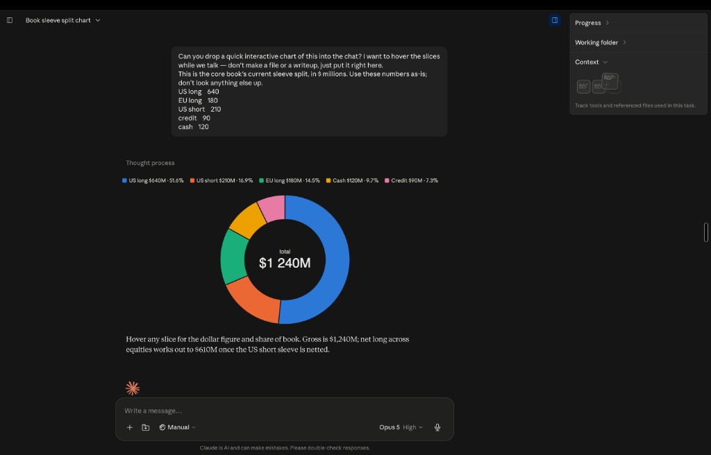
Here's what that looks like in practice. Two runs below, leveraging the same skill to render two different kinds of visuals.
How fast can skills actually be?
Before we shared this with our clients, we wanted to make sure the experience wasn't too slow. So we tested the strategy thoroughly and thoughtfully.
How we measured it
- One widget, held constant across every run — no variance from widget complexity.
- The prompt already carried the aggregated data — the clock measures build time only, never data-fetch or aggregation.
- A brand-new chat for every run — no warm context, no cached scaffolding carried over.
- Models alternated run to run, so no model got a fresher session than the others.
- Timer starts the moment the prompt is sent, stops the moment the widget renders successfully in chat.
Fastest wall-clock, but the widget it lands needs the most follow-up: shallow reasoning shows up later as rewrites and small regressions we have to catch.
The pick. Roughly half Opus's wall-clock, and the fewest regressions of any model in the set — one or two writes, and the widget holds up without hand-fixing.
Slowest of the four with no quality edge over Sonnet to pay for it.
Two to three writes, revised quickly and cleanly — but the extra care costs 20s over Sonnet for output we couldn't tell apart.
The split is the useful part: time-to-first-token is under two seconds everywhere, and reasoning is single-digit-to-teens — the bulk of the wall-clock is writing the widget. That's the rewrite cost from Fig. 1, measured: the faster models spend proportionally less time in code-gen.
Fastest isn't the same as best. Unsurprisingly, Haiku delivered the fastest result, but there were more follow-up passes, and small regressions to fix before the widget was usable. Sonnet came out of the set with the fewest regressions of any model, lands the widget in one or two writes, and still runs roughly half of Opus's wall-clock. When weighing time against quality, it was the best trade in the set. Opus and Fable spent 20-30 extra seconds for output, and the output wasn't significantly better. We eventually shipped the feature with Sonnet set as the default model.
The Routing Problem
Claude ships with its own built-in visualization tool, on by default, and it competes with our skill for the exact same intent: "chart," "graph," "visualize." We've been fighting it since the skill first shipped.
The first fix we tried was an org-level system prompt telling Claude to prefer our skill. It worked in testing, but we backed away from it — a rule like that has to be maintained centrally for every team and every future tool conflict, and it doesn't scale past one skill or one workspace.
So we went after the one lever that scales with the skill itself: instructions inside a skill's body only get read after that skill has already been picked. The only thing Claude sees before choosing is the short description field. The fix was rewriting description to claim the intent aggressively and name the built-in tool directly.

Closing the loop
After launching these visualization tools to select clients, we've seen an upwards trend in adoption. MCP connectors returning financial data are now significantly more powerful as a result of the visualizations that the AI can render directly within the chat session. We're actively working on a follow-up implementation, one that leverages a hybrid approach of skills for flexible requests, and MCP apps for more predictable ones. More to come on that soon!
If you're working on similar problems around generative UI for enterprise use cases, reach out. We'd love to hear more.
